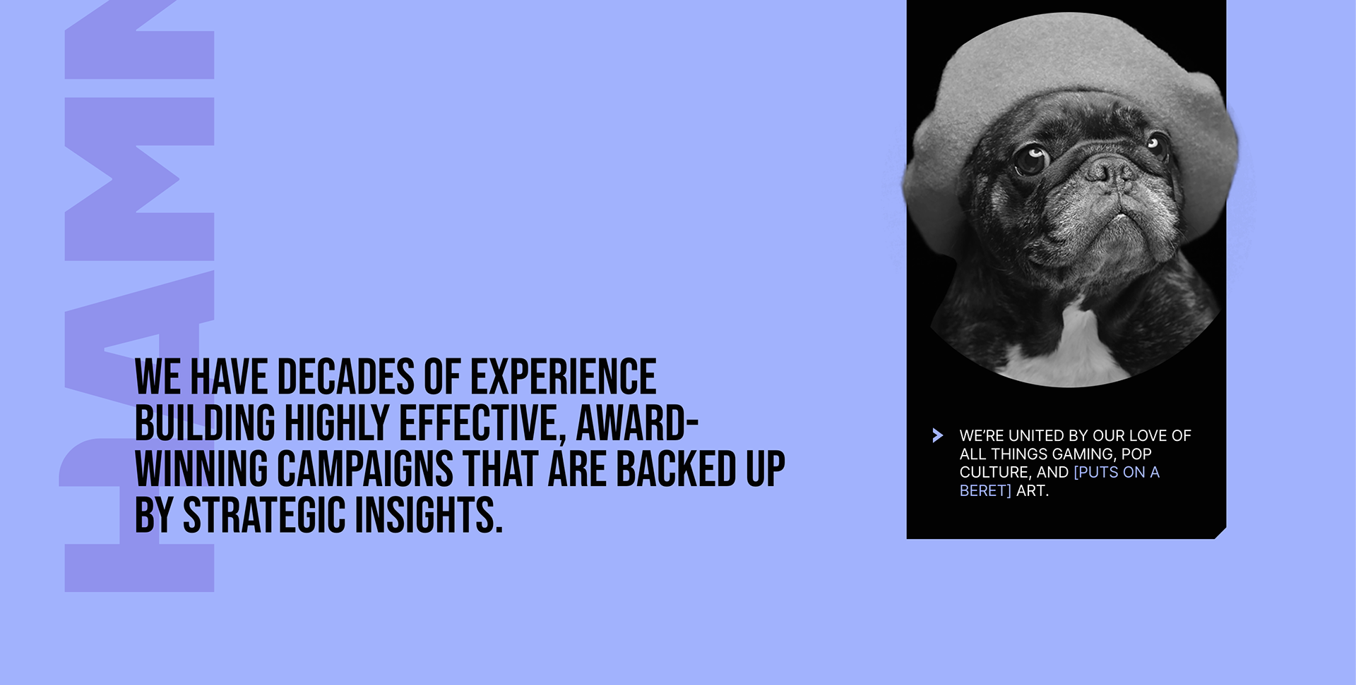
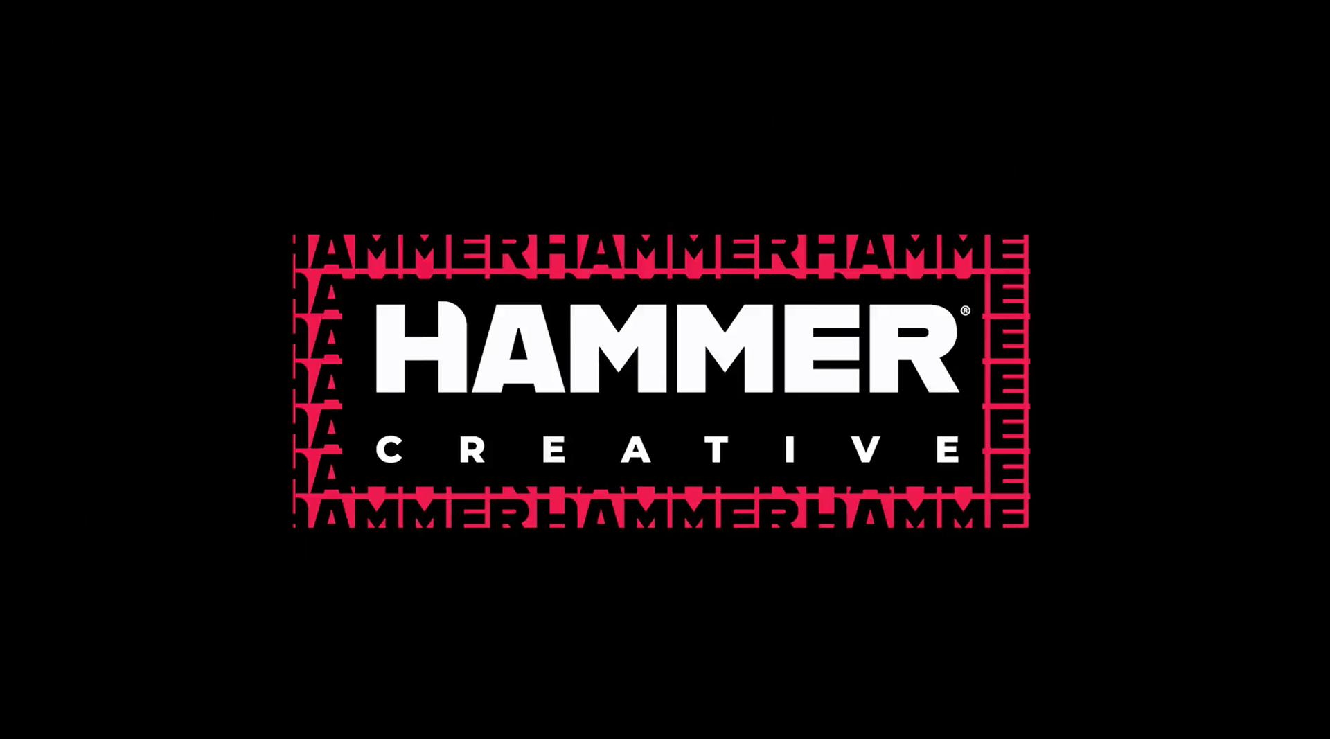
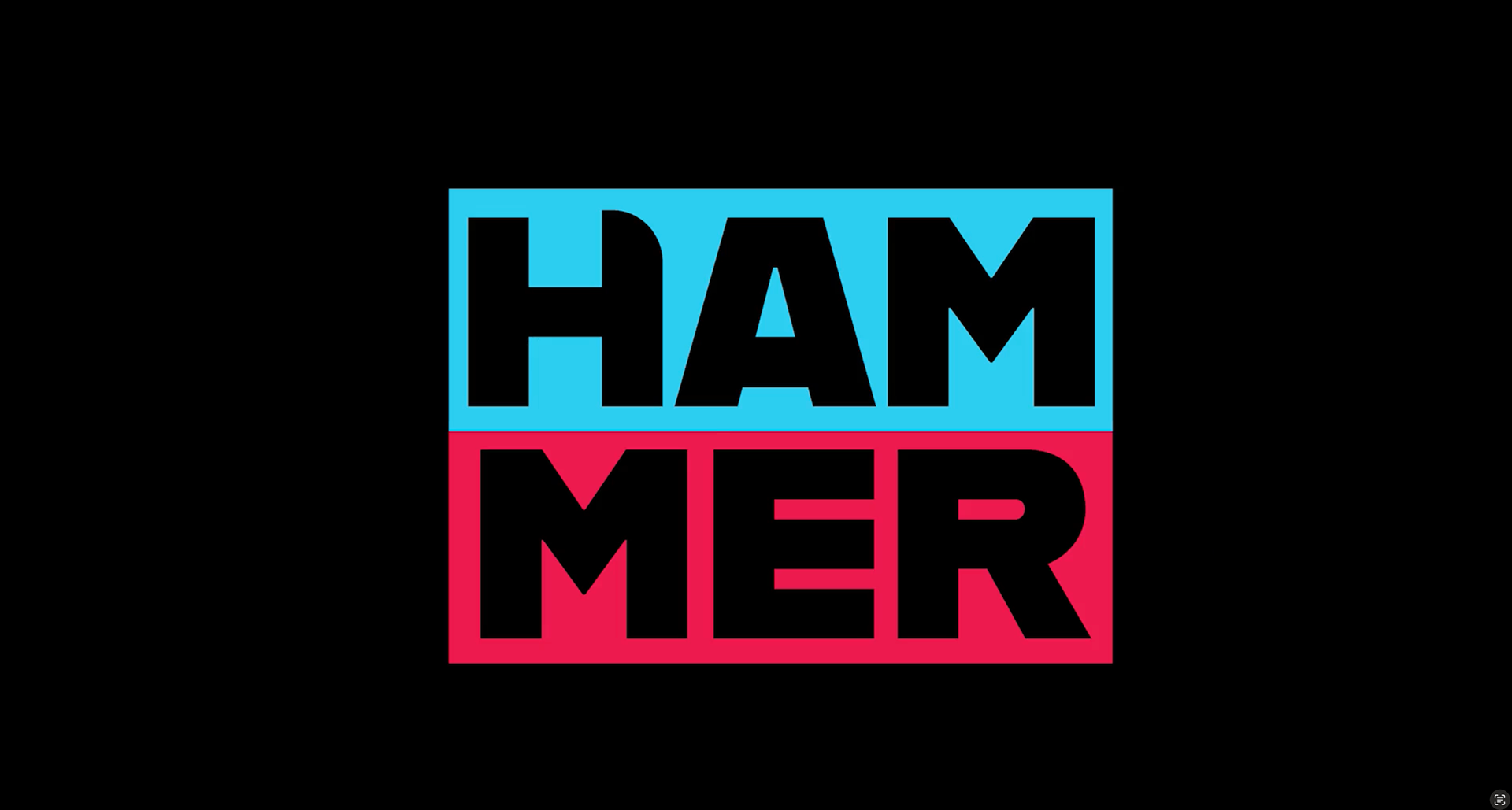
One of the first big projects i undertook at Hammer was to rebrand the company's logos and website. The previous iteration was very outdated and didn't do a great job of showcasing all the areas of expertise that are encompassed within the agency.
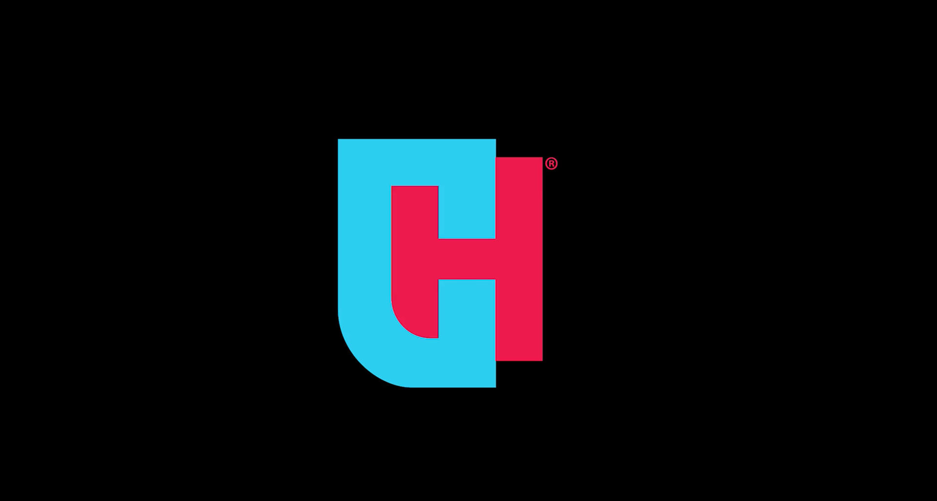
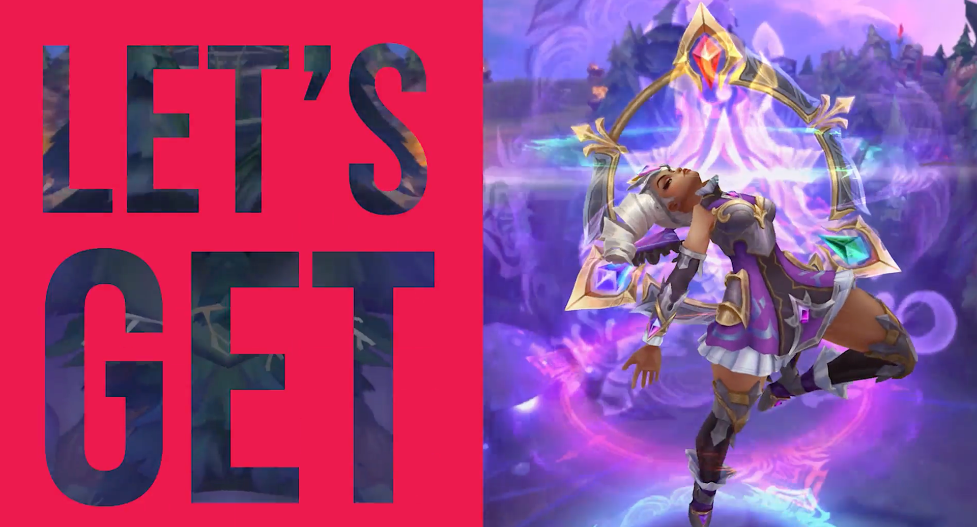
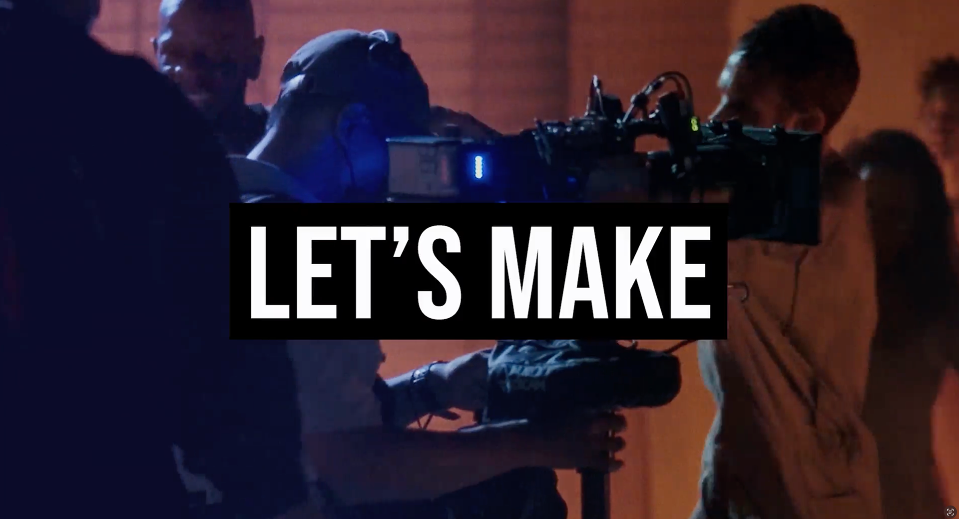
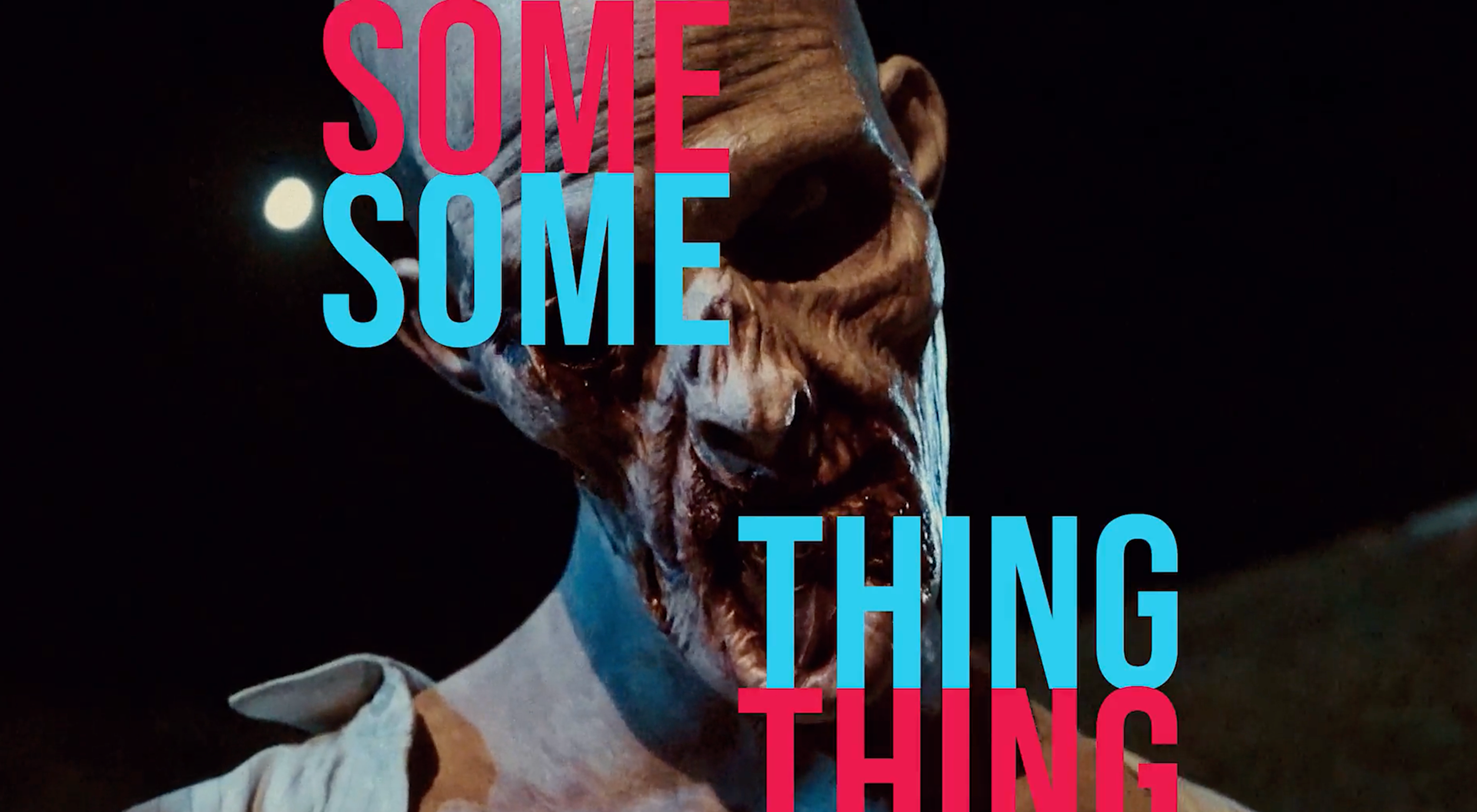
First we set out to make a clean, modern logo mark and then bring that into our reel before we outlaid it all in the website redesign. Check out the real thing below.
First we set out to make a clean, modern logo mark and then bring that into our reel before we outlaid it all in the website redesign. Check out the real thing below.
